

Ang Lee’s Hulk: Unique and Overlooked Colorful Cinema Amongst Superhero Homogeny
Article by: Rhett Brady I Staff Writer, BCS Chronicle
What You Need To Know:
Hulk is a film based on the comic book character of the same name directed by Ang Lee and released in 2003.
Hulk was met with mixed reviews from critics and audiences, but has gained a cult following.
The film’s use of color theory can lead the viewer to many hidden details in the storytelling and set design.
The editing, while a bit on the nose for referencing its comic book origins, is unique and offers some beautiful eye candy.
Hulk’s analog roots create an interesting analog-digital hybrid of filmmaking.
Superhero film productions before the establishment of Disney’s Marvel Cinematic Universe (MCU) were often unconnected, experimental, and heterogeneous in tone and style. Whether they’re considered a failure in the cultural zeitgeist on the level of Joel Schumacher’s Batman and Robin or the success of Sam Raimi’s Spider-Man trilogy, pre-MCU superhero cinema can have many interesting case studies. These films also suffer generally from less of the heavy studio interference that has plagued many contemporary connected universe superhero productions from Disney and Warner Brothers. Languishing in a long development for many years, an adaptation of Stan Lee’s and Jack Kirby’s The Incredible Hulk finally found footing with Taiwanese-American filmmaker Ang Lee at the helm and James Schamus writing the story.
Released in June of 2003 to mixed reviews from critics and audiences alike, the film was a minor box office draw, grossing $245,285,165 worldwide on a $137 million production budget. As noted, the film did see some negative reviews upon release, with the Sacramento News and Review describing how, “The spectacular special effects and Lee's use of split screens provide some relief in a nonetheless tedious tale in which Nick Nolte (looking much like his recent mug shot) provides several unintentional laughs as Banner's father” (Halverson, 2003). More recently, however, the film has received some reappraisal from critics. “The decision to allow Ang Lee to transform Hulk (2003) from a superhero saga into something resembling an actual art film. (This did not endear it with most moviegoers, but the resulting film is a genuinely great example of cinematic pop art that deserves a reappraisal;)” (Sobczynski, 2018). This work will seek to examine the film’s use of theoretical color, extravagant cinematography, comic book-like uniqueness, and combination of computer-generated imagery with analog filmmaking during the start of the digital revolution to assert why the film should be revisited by modern audiences and fans of the Marvel Cinematic Universe.
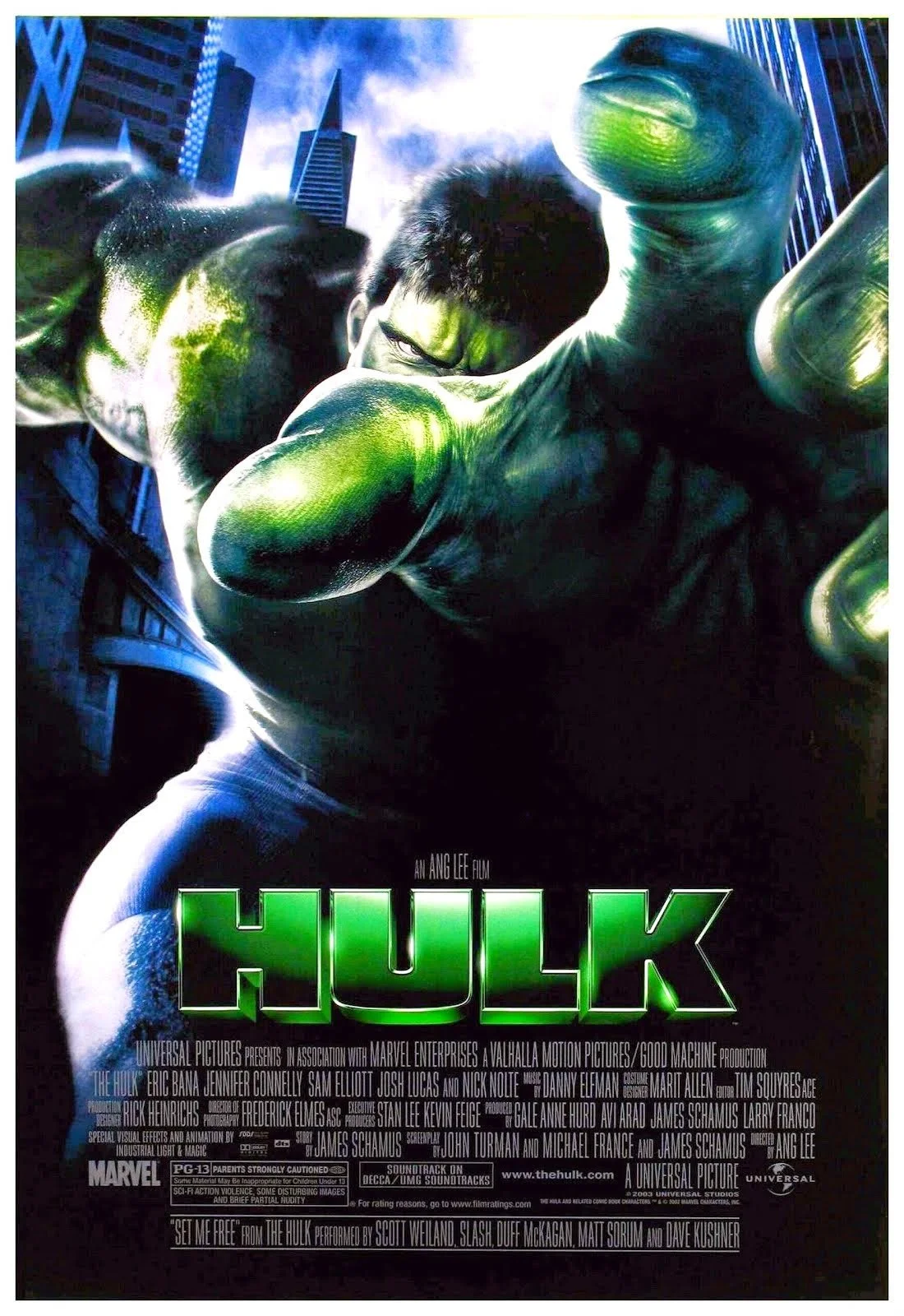
Original Theatrical Poster
One of filmmaking’s greatest achievements is color photography and the integration of traditional color theory within the medium. The film’s comparison to pop art is something that mirrors the character’s comic book origins and is an element that deserves in-depth exploration. Hulk was shot by cinematographer Frederick Elmes, who previously collaborated with Lee on The Ice Storm. In an interview with the film magazine American Cinematographer, Elmes said that the film had an interesting artistic expression with colorful filmmaking. (2003)
Having its basis in a comic book, the film takes inspiration from the colors of its source material. In the study of color theory, purple and green are considered secondary colors and are on the cooler side of the color spectrum. Green is connected with growth, money, greed, or wealth. Purple is connected with royalty, power, and independence. It should be noted that this perspective regarding the Hulk’s usage of color theory is coming from someone who suffers from colorblindness, so the film’s pop art palette being examined could lead to interesting differences between different people. According to Comic Book Pile, a comic book-centric website, comic book color has the ability to heighten reality and help establish the mood. In the context of this film, Hulk’s iconic purple shorts are a signification of his power. His green skin can represent his physical growth, along with the greed of the United States military wanting to use his curse for weapons manufacturing and profit. Many of the film’s principal cast are depicted as wearing purple or green, the Hulk’s signature colors. Lee has always been an auteur with the use of color in his films, so Hulk’s strategic and inspired use of color isn’t surprising.

Hulk’s signature purple shorts
(Image courtesy of Universal Pictures)
Repeated viewings of the film reveal more of the intricacies of the color design. The practical set design oozes with bright primaries during daylight and penetrating darks at nighttime. The Hulk’s green color hue is very similar to Boris Karloff’s Frankenstein’s monster, with both Stan Lee and Ang Lee (no relation) citing that as inspiration for the creation of the character and the choice for the film. The hue is essential to the color design, with the book Colour Design: Theories and Applications saying “The more extreme the difference is between object colour and context colour, the greater is the tendency of the object to draw the viewer’s eye,” (Best, 2017). Karloff’s color set photography showcases the color of the monster, and he stood out amongst the gothic set design, just as the Hulk does in his modern and colorful world. The similarities between the Hulk and Frankenstein’s monster don’t end there, with University of Southern California professor Leo Braudy saying that they both represent the desire to dominate the modern world. (2016)

Boris Karloff in color
(Image courtesy of Universal Pictures)
A great example of the film’s color design is the Hulk’s action scene with the fighter jet in San Francisco. It is a visual treat for the eyes. The Hulk had jumped to San Francisco, and he leaped onto the Golden Gate Bridge. A pair of fighter jets are chasing him, and to avoid hitting each other, one of the pilots flew down and almost hit the bridge. The Hulk, in an attempt to stop disaster, jumps onto the plane and prevents it from crashing into the bridge. At the advice of General Ross, the pilot flies to the top of the world to see if the thin air will make the Hulk pass out. Flying to the top of the atmosphere with pulsating blue skies, a sunny day in a metropolis, the beautiful views of the Pacific Ocean, and the Golden Gate Bridge while he’s falling through the clouds. It is quite a sight to behold.
A central arc between Bruce and his father, David, explores a broken father-and-son relationship. Their scenes together, along with many scenes featuring David with other characters, take place at night or inside with more muted colors. During a conversation with Jennifer Connelly’s character, Betty Ross, at David’s home, the presence of neutral earth tones is commonplace but with subtle use of green in the wallpaper of his living room. When he has a conversation with Bruce in his hospital room, the use of white in the architecture is banal, but his dark purple attire helps the color palette pop in this mundane setting. The confrontation between Bruce and David during the nighttime is photographed like a play. In a play, the actors are the most important element. There is a minimal set, and the bright lights are shining on them to exaggerate and showcase their performances. The lights can also bring attention to their facial expressions. In the scene, bright spotlights are blowing up Eric Bana and Nick Nolte’s surroundings, while the background is completely pitch black. The soundstage is on the actors’ shoulders, and their dialogue is reverberated throughout the soundstage, perfectly combining sound and visuals. This is the first time Bruce confronts David with him knowing about his familial history, and the stage lighting highlights the excellent theatrical performance full of emotion.
The bright and theatrical lighting used in the movie also enabled the 35mm film to capture all of the small details. This is a synthetic lighting filter technique that chief lighting technician, Jim Tynes, said they would use with different gels in the lights to create unique skin lighting and a push toward white light with color tint.
Hulk’s confrontation and metaphysical battle with David Banner (inspired by the villain, the Absorbing Man) is dark in tone and visuals. Visual effects co-supervisor of the film, Ed Hirsh said, “The sequence was originally written to take place at dawn, but I felt it would have much more power and mystery if it took place at night… Ang seemed to like the idea of seeing that beautiful mountain lake under the moonlight shrouded in darkness,” (Magid, 2003). Taking place at the real-life Pear Lake in Sequoia National Park, the Hulk is eventually absorbed into the lake, because his father takes the shape of the water. His father, exposing himself to the same type of gamma radiation as his son did earlier in the film, gave him powers to absorb the energy of anything that he touches. This exhibits lovely underwater cinematography. The visual effects shine with the green streaks of light illuminating the water. David Banner’s attempt to take all of Hulk’s power creates a euphoric image of green and blue among the darkness of the underwater depths. The visuals are executed to such a high standard that the artistry of comic book storytelling is translated into filmmaking seamlessly. Watching the film in 4K HDR (high dynamic range) gives the scene and the film as a whole a new coat of luscious paint across the board, and helps breathe new life into the analog photochemical origins of the film negative.
Colorful filmmaking is one of the most important ingredients in this cinematic recipe, but the unparalleled and comic book-faithful editing is something that makes it truly stand out from the post-production level. Hulk is unlike any film released before or after from an editing standpoint. Taking the comic book panel to the big screen was an inspirational and interesting choice, one that likely will continue to see the film to be examined by Marvel fanatics. Academy Award-nominated editor Tim Squyres has worked with Ang Lee on 13 films, and Hulk is another one of those collaborations. Speaking on the film, Squyres said, “All of that stuff, there is a ton of it in the movie, a lot of split screens. That’s editing. That’s not visual effects. In that film, that’s a fundamental part of the language of telling the story,” (Manhattan Edit Workshop, 2012).
Comic books over time have become a lot more intricate with the design of the panels, along with the storytelling the panels can convey. The filmmakers likely took inspiration from writer Peter David’s 12-year run of the character. Various artists worked on the book throughout those 12 years, but the overall color scheme and consistency of the quality of the art were astounding.

Cover of one of Peter David’s most famous Hulk stories, Future Imperfect with art by George Perez
(Image courtesy of Marvel Comics)
In an interview for the DVD release of the film, Ang Lee said that he wanted to take the multiple-panel look of a comic book and translate them into a filmmaking medium. Many scenes throughout the film feature Lee’s “multi-image” composition. The entire film was storyboarded, so many of the multi-image shots were deliberate from the beginning. Many sequences that would have been otherwise mundane benefit from the comic book panel editing, and it required many alternate takes and camera setups to accomplish. Scenes with intimate dialog often feature a more linear cinematic structure but aren’t without use. The test of the gamma radiation on the frog in the first act allows the audience to see all of the intricacies of the gamma machine with the simultaneous reactions of the characters. It also helps add tension since the screen is crowded with picture information. However, the Hulk isn’t all talk, he’s more action, especially with that bad temper of his.
Scenes with a lot of on-screen action, but not necessarily action scenes, feature the multi-image comic book panels. After the Hulk escapes his makeshift prison in an underground military base, he heads for San Francisco to find Betty Ross. After falling from the top of the world because of losing consciousness in the Pacific Ocean, he swims into the city sewer system and makes his way to the streets through the underground pavement. He breaks out the cement, smashes the ground with his fists, and causes a car pileup with mass hysteria. Betty Ross lets herself be seen by him in a helicopter, which causes him to start calming down. Before he can think, an entire militia is heading his way on the streets. The United States army, local police department, and special forces surround him with more firepower than some countries' entire military.
The split screen captures everything in the scene. The local police in the streets, the military in their tactical vehicles equipped with turrets, special forces on the roof of every building in the vicinity, and attack helicopters surrounding him in the sky. The panels showcase the production value of the scene, along with the faces of the actors playing the opposition. They also do a great job of showing the choreography preparation for each take. The scene likely took multiple days to shoot because of the variety of takes. Wide shots help establish the scale of the scene as well, showcasing the excellent helicopter shots presumptively from the second unit production photography team.

Quadruple panels
(Image courtesy of Universal Pictures)
The Hulk’s visual effects led the photography team to work with, at the time, cutting-edge computer-generated images and the challenge of integrating him into the real world. Elmes said, “On some level, it’s a family drama with one character that has a particular problem — a very large one…We started with the premise that he had to be completely believable, and that drove the whole look of the character emotionally and visually. It was a real test for ILM (Industrial Light and Magic) on a lot of levels, because making the character animation work with those subtle details is not an easy thing,” (Magid, 2003).
Before the widespread use of computers for filmmaking and scanning, movies shot on 35mm or large format film such as 70mm were finished with what is called the photochemical process. When the film is put through photochemistry, the light it is exposed to will help reveal the colors and image. It’s a very complicated and scientific process, and that’s why digital intermediates became the overwhelmingly preferred method. Also, with the rise of the digital work bay and digital cinematography, the use of the photochemical method is becoming a lost art among new generations of filmmakers.
Digital photography has become important for the industry. It has effectively replaced 35mm photography because digital offers quicker shooting for production and easier integration of large-scale visual effects. Digital video-capturing technology has existed since the 1950s, but the increasing budget of Hollywood productions and the use of computer-generated images to create breathtaking worlds has created a demand for digital-only with special effects-heavy productions.
Hulk was finished photochemically, which is an interesting contrast to the visual effects-heavy production. The traditionalist photochemical finish can provide wonderfully detailed imagery, even if computer-based color correction is the industry standard. Convenience and ease of use are usually more important to a CGI-heavy production than artistic aesthetic, but this wasn’t the case when Hulk was released.

A film negative
(Image courtesy of Cottonbro Studios)
Elmes said about the computer finish method, “Our tests told us that the digital-intermediate process isn’t completely transparent yet. The work ILM has done is very good and I have complete confidence in them, but we didn’t want to add this additional layer over the rest of the film as well,” (Magid, 2003). Directors such as Christopher Nolan prefer the photochemical process to this day, with Nolan claiming that the process is more reliable and cheaper in the long term. Shooting on film has become more of an aesthetic choice rather than a necessity since the adoption of digital technology.
Perhaps in a show of irony, the choice to finish Hulk with the photochemical process gives the film a timeless and organic appearance. The image is rich with detail, and the resolution of analog 35mm Kodak film holds up as well as it did during the original theatrical release. Ang Lee’s use of intimate close-ups of the actor’s faces reveals some of the most textured faces in a comic book film. The choice was likely used to show the intimacy of the character interaction, but the stylistic choice can translate well into filmic beauty. The extravagant set design is well showcased in the cinematography.

Close up of the film’s star, Eric Bana
(Image courtesy of Universal Pictures)
The use of the previously mentioned practical sets has stood to scrutiny, and no one can complain of them being substandard. The film had a blockbuster budget and is of blockbuster quality. Hulk and its cinematography are often an overlooked aspect of the film, and the cinematographer and his team deserve more credit for accurately translating the colorful comic book world through the photochemical process.

Hulk’s DVD menu
Ang Lee created something special. It is still unlike any other film in its genre, and it should be celebrated for its unparalleled successes rather than the faults that are greatly exaggerated. The film’s attention to color and use of color theory, the wholly unique comic book editing, and the hybrid of a major digital creation with an analog origin. Everything comes together to create something memorable, for better or worse. The film has its detractors because of the long run time, melodramatic tone, and for taking itself too seriously.
Reading all of the supplemental material, interviews, and behind-the-scenes will show evidence of how much work went into creating Lee’s vision in a world with the Marvel Cinematic Universe and the lack of a filmmaker’s imagination, it should be respected no matter the flaws. The use of color in its storytelling is unique in the comic book genre, and the wonderful visual effects are why it should be revisited. Hulk is a film that should be talked about more often for what it gets right, and not what it could have been in someone else’s eyes.
References
5 Important Applications of Photochemistry in Modern Life. (2017, November 17). AZ Chemistry. https://azchemistry.com/applications-of-photochemistry-in-modern-life
Best, J. (Ed.). (2017). Colour design : Theories and applications. Elsevier Science & Technology.
Bourn, J. (2016, June 4). Meaning of The Color Green |. Bourn Creative. https://www.bourncreative.com/meaning-of-the-color-green/
Bourn, J. (2016, June 4). Meaning of The Color Purple |. Bourn Creative. https://www.bourncreative.com/meaning-of-the-color-purple/
Braudy, L. (2016, Oct 28). Where Our Monsters Come From; Godzilla, the Incredible Hulk, zombies: Today's monsters reflect our anxieties about scientific and social progress. Wall Street Journal (Online) http://proxy.library.tamu.edu/login?url=https://www.proquest.com/newspapers/where-our-monsters-come-godzilla-incredible-hulk/docview/1833122037/se-2
Chris Nolan Goes Photochemical In DGA Quarterly Interview. (2012, April 12). Movie City News. http://archive.moviecitynews.com/2012/04/chris-nolan-goes-photochemical-in-dga-quarterly-interview/
Hulk. (n.d.). Box Office Mojo. Retrieved September 24, 2022, from https://www.boxofficemojo.com/title/tt0286716/?ref_=bo_rl_ti
HULK (2003) | Unique Style of Editing The Hulk Featurette. (n.d.). www.youtube.com. Retrieved September 25, 2022, from https://www.youtube.com/watch?v=opDcEPqxJzg
Korman, K. (2019, October 18). A Brief History of Cinematography for Today’s Creatives. Skillshare Blog. https://www.skillshare.com/blog/a-brief-history-of-cinematography-for-todays-creatives/#history-of-cinematography
Magid, R. (2003, July). A Spectacular Virtual Vista [Review of A Spectacular Virtual Vista]. American Cinematographer, 54–55. Print - In Hand.
Magid, R. (2003, July). Growing Pains [Review of Growing Pains]. American Cinematographer, 46–57. Print - In Hand.
SN&R • Film • Short Reviews • The Hulk • Jun 26, 2003. (2005, July 6). Sacramento News & Review. https://www.newsreview.com/sacramento/content/the-hulk/15312/
Sobczynski, P. (n.d.). Stan Lee: 1922-2018 | Features | Roger Ebert. Https://Www.rogerebert.com/. Retrieved September 24, 2022, from https://www.rogerebert.com/features/stan-lee-1922-2018
Spencer, D. (2022, July 28). What are the color combinations used in the comic book superhero characters? Comic Book Pile. https://www.comicbookpile.com/what-are-the-color-combinations-used-in-the-comic-book-superhero-characters/
Williams, D. (2003, July). Temper, Temper [Review of Temper, Temper]. American Cinematographer, 34–45. Print - In Hand.
Workshop, M. E. (2013, February 5). Editor Tim Squyres, A.C.E. on Editing “Hulk.” Vimeo. https://vimeo.com/58992411